Responsive E-Commerce Website Design for Kaus
Kaus has been in the insurance business for over 30 years. They have been working through regional agents, selling the policies to them instead of directly to customers. With the rise of the internet and personal devices, Kaus has been losing ground. They want to attract young people who are more digital than ever and tap into that digital market.
UX & UI
Research
design system
Timeline: 4weeks
To have a better sense of the insurance industry standards and trends, I did a SWOT analysis on competitors and also conducted a marketplace research at the beginning of the project.
After the initial research, I started to wonder:
To find the answers, I interviewed 4 participants to find out more about how people buy and manage their insurance.
Paticipants answered to following questions:
1. Do you currently have insurance? If so, for what? Which companies?
2. What ultimately led you to picking this company?
3. How much cross shopping did you do when selecting your insurance plan?
4. Are there any aspects e.g. having an app that are a deal breaker for you?
5. Have you ever worked with another insurance company? What factors led you to switch?
6. Have you bought insurance online? If so, can you tell me more about the experience?
7. What would you do if you have any questions in the shopping process?
8. Have you ever made a claim against your insurance policy? What was that experiencelike?
9. When shopping for insurance online, is there anything you wish you could do that’s notcurrently possible?
I synthesized the research results and created the Persona. Eric’s goals, needs, frustrations, and motivations will guide me further making design decisions.
With a better understanding of users’ goals, needs, motivations, and pain points when dealing with insurance, I started to wonder:
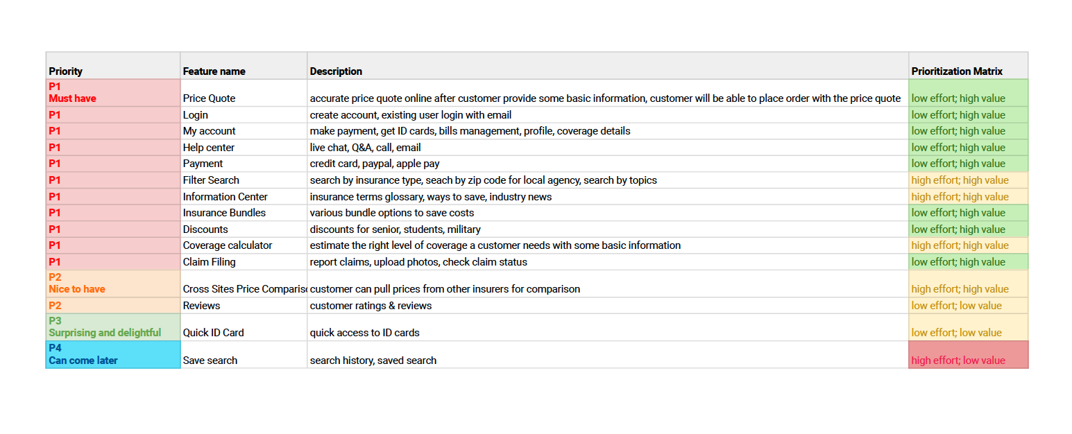
Before I started to explore the solutions, I revisited Kaus business goals with the Persona’s goals in mind, and prioritized the product features based on the Project Goals Diagram.
I revisited the business goals and the user goals.
Feature Roadmap:
When building the Information Architecture, I wanted to make sure the site navigation is clear and users can quickly locate any information they need. I synthesized the Optimal Card Sorting results and created the site map for Kaus.
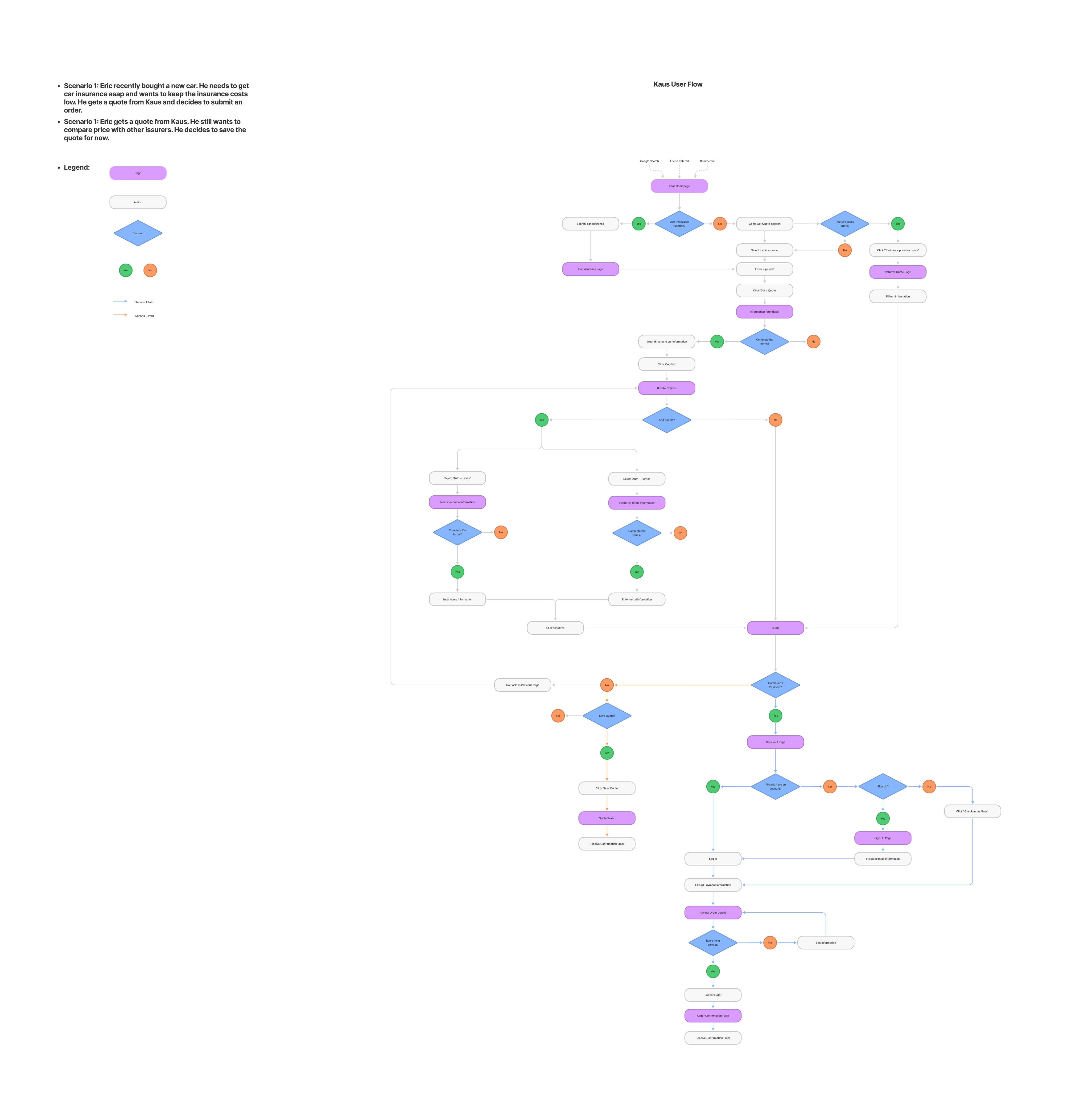
The goal was to create a simple and seamless flow starting from browsing insurance products to finishing the online application.
With the user flows and site map designed out, I started to sketch out and explore different versions of solutions for the website.
When making this decision, I looked back at the user research findings: users prefer low costs with just enough coverages and they often don’t know what coverages they need.
Thus, I went with one final quote pricing with the coverages calculated based on users’ inputs instead of asking users to choose from several plans.
Users will still have the flexibility to customize the coverages.
I conducted a round of usability testings on major task flows and A/B testings with the Vehicle Details page.
Using Zoom video call, I monitored 5 participants completing major task flows in real time. With this I was able to catch errors and bugs for product revisions.
Usability testing was conducted with below prototype:
To find out which concept is a prefered solution for a situation where a customer has multiple vehicles on the quote, I set up an A/B testing with 5 participants
Concept A
Horizontal Tabs
Concept B
Vertical Scroll
Before
The information explaining why vehicles appear automatically was less obvious. 75% of participants missed this information during testing. Missing this information caused confusion in the following steps of the quote flow.
After
I tweaked the typeface and text color to make the message more obvious.
I was able to conducted a round 2 testing with a result showing 100% partifipants noticed the message.
Before
All testing participants expressed that it took too long to scroll to the bottom to the quote result page. I noticed this might affect the conversion rate and fixing this issue is crucial.
After
I added a button to make the list collapsible. This shortens the scrolling time and also allows flexibility.
Before
I was able to identify a major problem with the my account page in testings. There is no affordance indicating that a dropdown menu will appear after profile photo is clicked.
After
I added a chevron next to profile photo for better affordance.