Improve community
and individual engagement

Website redesign for Stars of HOPE

Stars of HOPE is the world’s largest and fastest-growing healing arts program. Started by New York Says Thank You Foundation in 2007, SOH is pioneering a new paradigm at the intersection of disaster relief, mental health, and therapeutic art.

UX & UI
Research
design system
Timeline: 6 weeks

EMPATHIZE

User Interviews

In order to understand what makes people decide which nonprofit organization to be involved with, I conducted the initial user research with below methods:

  • one-on-one interviews via Zoom
  • survey on subreddits like Nonprofit and Volunteer

Paticipants answered to following questions:

1. Have you volunteered or thought about volunteering before?
2. What social issues are you interested in?
3. What do you know about disaster relief, mental healing, therapeutic art?
4. What do you know about disaster relief, mental healing, therapeutic art?
5. And from where do you receive that information?
6. What makes you decide where to volunteer/donate?
8. What do you consider as success for an NGO?

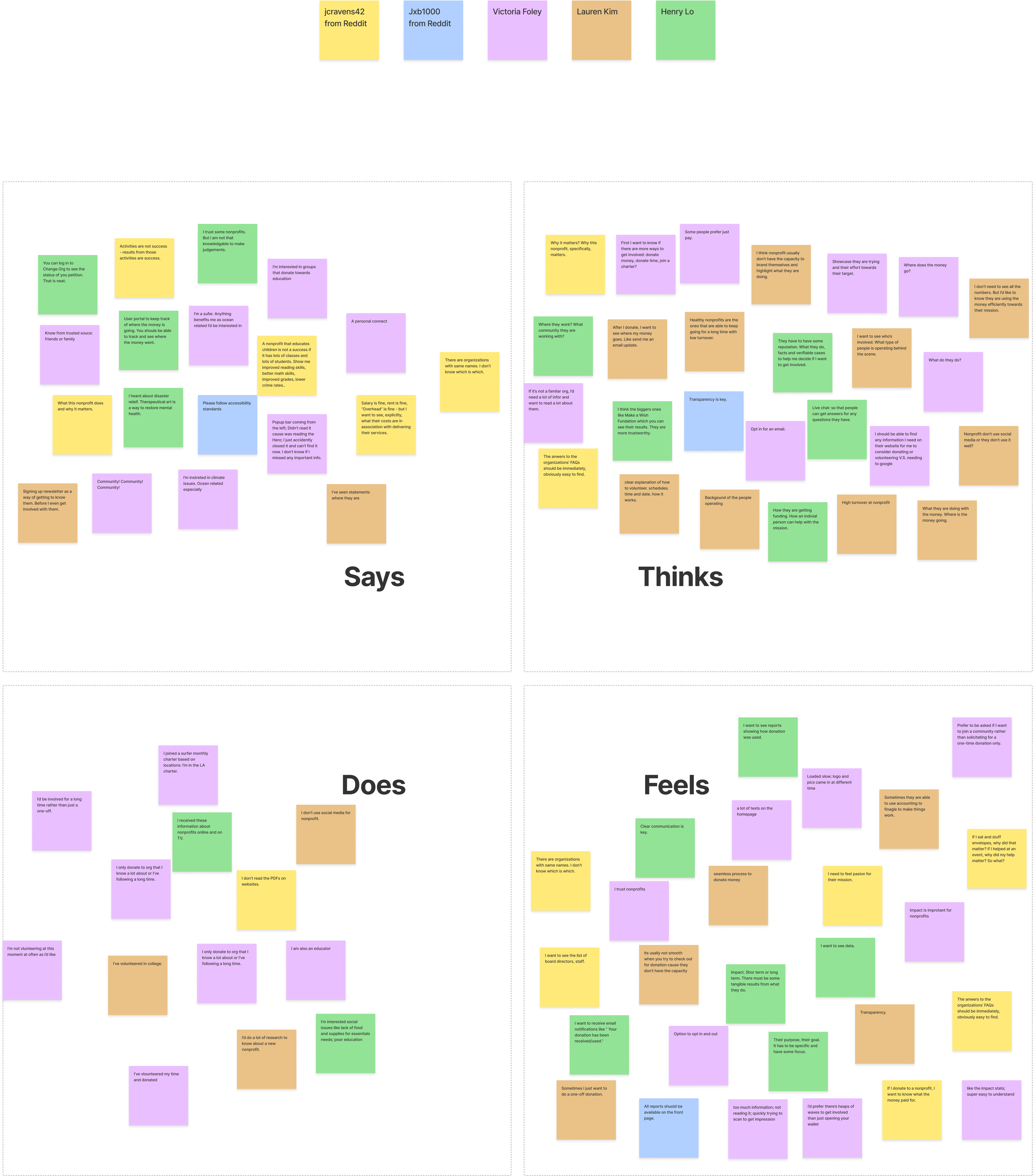
Empathy Map

I synthesized the interview notes with below empathy map.

Click here to see empathy map

Key Insights:

  • Findability of information is critical for people to make decisions on whether to get involved.
  • People want to see impact and results before getting involved.

Usability Testing

To find out how easy/difficult it is for users to find information on the current website. I conducted:

  • one-on-one interviews via Zoom
  • survey on subreddits like Nonprofit and Volunteer

Key Findings:

  • Many links in the current main navigation menu are duplicated multiple times.
  • 60% of participants failed at locating the FAQ section.
  • 75% of participants failed at finding the Call to Action.
  • All participants expressed that it's not clear to them what SOH does and how to get involved at first glance of the homepage.
  • All participants expressed too many texts on the homepage are making it hard for them to have a quick understanding of the organization.

DEFINE

To help me synthesize and articulate what I learned from user research, I created the Persona Lisa. Her goals, needs, frustrations, and motivations will guide me further making any design decisions.

Meet Lisa,
the Persona.

With a better understanding of the users and their pain points with the current website, I started to think:

How might we improve findability of information?

How might we effectively showcase the impact?

IDEATE
& PROTOTYPE

New Site Map

Backed by the research findings, I presented below changes on the site map to stakeholders. They got immediately on board with these changes.

Click here to see site map

User Flowchart

I created 4 scenarios based on SOH's user segments and designed the user flows for school/community/corporate, volunteer, donate, and Box of HOPE kit order. The flow chart helped me better organize the site's information to create journey paths with better user experience. I was also able to identify the key pages I needed for future usability testing.

Click here to see flow charts

Skeches & Wireframes

With the restructured IA, I started to sketch out the main pages for the website.

Design System

Lacking a design system, the existing experience is not consistent across the current website. In order to improve consistency and allow developers and other designers to collaborate, I built a design system for the new website.

High-Fidelity Prototype

After several rounds of iterations, a consensus was made to use an iteration for testing that balanced both bright color scheme and modern look and feel, examples shown below.

Testing

10 people were recruited for a usability test. 5 were unmoderated and 5 were moderated.

Participants were asked to completed tasks based on 4 scenarios: apply for a school project, contribute as an individual, volunteer as an art therapist, and understand SOH's mission as a potential donor.

Key Findings:

  • All participants found the mission of the organization was clear on the website.
  • All participants expressed that the site was easy to navigate and information was easy to find.
  • All participants completed the tasks with 80% direct success and 20% indirect success.

"Looks nice, minimalist and straight to the point. Stuff is easy to find and paths are clearly defined."

"It's really easy to navigate!"

"Modern, straightforward, and bright. The colors really feel appropriate for the nonprofit's mission."

website Tour